Mobile SEO in 2025: Optimizing Your Site For Mobile Devices
Imagine a world where every search is instant, intuitive, and perfectly tailored to the user’s mobile context. That’s the reality we’re heading towards in 2025. Mobile SEO is no longer just about rankings, it’s about delivering seamless, personalized experiences that resonate with on-the-go users.
In the coming years, factors like AI-driven search, voice optimization, and hyper-localized targeting will redefine the rules of the game. In this article, we’ll unpack the key elements of user-centric mobile optimization, and reveal how you can create content that truly connects.
What Is Mobile SEO?
Mobile SEO, or Mobile Search Engine Optimization, is the practice of optimizing your website to ensure it performs exceptionally well on mobile devices like smartphones and tablets.
It’s about making your site easily accessible, user-friendly, and highly visible in search engine results when accessed from a mobile device.
Why Is Mobile SEO Important?
In a world where smartphones are glued to our hands, ignoring mobile SEO is like ignoring a massive chunk of your potential audience. It’s not just a trend; it’s a fundamental shift in how people access information. So, why exactly is mobile SEO so crucial? Let’s break it down.
1. Mobile-First Indexing: Google’s Priority
Google has transitioned to mobile-first indexing, meaning it primarily uses the mobile version of your website to determine its ranking. If your mobile site is subpar, your overall SEO performance will suffer, even on desktop. This alone should be enough to underscore the importance of mobile optimization.
2. The Sheer Volume of Mobile Traffic
Think about your own browsing habits. How often do you reach for your phone to search for something? Chances are, it’s quite often.
Mobile internet usage is continuing to grow significantly. Over 60% of website traffic comes from mobile devices in 2025.
Mobile devices account for a significant and ever-growing portion of internet traffic. Ignoring mobile SEO means missing out on a huge potential customer base.
3. User Experience is Paramount
Imagine trying to navigate a website designed for a desktop on your tiny smartphone screen. Frustrating, right? A mobile-optimized site provides a seamless and enjoyable user experience. This translates to:
- Lower bounce rates: Visitors are more likely to stay if your site is easy to use.
- Increased engagement: A positive experience encourages interaction.
- Higher conversion rates: Happy users are more likely to become customers.
4. Local SEO and “Near Me” Searches
Many local searches, like “restaurants near me” or “coffee shops open now,” are performed on mobile devices. If your business relies on local customers, mobile SEO is non-negotiable. Optimizing for local mobile searches ensures your business appears when potential customers are nearby.
5. Voice Search Optimization
With the rise of voice assistants like Siri, Google Assistant, and Alexa, voice search is becoming increasingly common. Mobile SEO plays a crucial role in optimizing your content for conversational queries, which are often used in voice searches.
6. Staying Competitive
Your competitors are likely already investing in mobile SEO. If you lag behind, you’ll lose valuable ground. Providing a superior mobile experience can be a significant competitive advantage.
Implementing A Mobile Website That Ranks On Google
In the mobile-first era, a website that doesn’t perform well on smartphones is essentially invisible to a huge portion of your potential audience. But how do you create a mobile website that not only looks good but also ranks high on Google? Let’s dive into the essential steps:
Responsive Design
Responsive design ensures your website adapts seamlessly to any screen size, whether it’s a smartphone, tablet, laptop, or desktop. Instead of creating separate mobile versions (like m.dot sites), a responsive site uses flexible layouts, images, and cascading style sheets (CSS) to automatically adjust its elements.
When it comes to building a mobile website that ranks well on Google, responsive design isn’t just a recommendation – it’s a necessity. It’s the bedrock upon which a successful mobile SEO strategy is built.
Why is it Crucial for Mobile SEO?
- Google’s Preference:
- Google favours responsive design. It provides a consistent user experience across devices, which aligns with Google’s focus on user-friendliness.
- With mobile-first indexing, Google primarily crawls and indexes the mobile version of your site. A responsive design ensures that this version is fully functional and contains all the necessary content.
- Enhanced User Experience:
- Mobile users expect a smooth and intuitive browsing experience. Responsive design delivers just that, reducing bounce rates and increasing engagement.
- A site that’s easy to navigate on a small screen keeps users happy, which can positively impact your rankings.
- Simplified Website Management:
- Maintaining a single responsive website is far more efficient than managing separate mobile and desktop versions.
- This reduces development time and costs and ensures consistency across all devices.
- Avoidance of Mobile Errors:
- Responsive design minimizes the possibility of mobile usability errors, that can occur when using separate mobile sites.
- This improves the overall health of your website in the eyes of search engines.
Dynamic Serving
- How it works:
- Dynamic serving uses the same URL for both desktop and mobile users.
- The server detects the user’s device (user-agent detection) and then delivers different HTML and CSS code accordingly.
- This allows for tailored content and presentation based on the device.
- Potential usefulness:
- Highly customized experiences: Dynamic serving allows for very specific optimizations for different devices, potentially leading to a superior user experience.
- Control: it gives the webmaster fine-grain control over what content is shown to each device.
- Challenges:
- Complexity: Accurate user-agent detection is crucial, and errors can lead to serving the wrong content.
- Maintenance: it can add complexity to the maintenance of the website.
- SEO considerations: Proper implementation of the “Vary: User-Agent” HTTP header is essential to ensure Google can correctly crawl and index the different versions of the page.
Separate URLs
- How it works:
- This method involves creating separate URLs for desktop and mobile versions of the website (e.g., www.example.com and m.example.com).
- When a user accesses the site, the server redirects them to the appropriate URL based on their device.
- Potential usefulness:
- Complete control: Separate URLs offer complete control over the mobile version of the site, allowing for significant differences in content and design.
- Legacy systems: In some cases, especially with older websites, separate URLs might be easier to implement than a complete redesign.
- Challenges:
- Complexity: It adds complexity to the website structure.
- SEO considerations: Proper implementation of rel=”canonical” and rel=”alternate” tags is crucial to avoid duplicate content issues and ensure Google understands the relationship between the desktop and mobile versions.
- User experience: Redirects can sometimes introduce latency, and maintaining separate URLs can be more time-consuming.
Optimize for Page Speed
PageSpeed, the measure of how quickly your web pages load, plays a crucial role in both user experience and search engine rankings.
PageSpeed is a critical element of technical SEO and improving user experience. It is also a confirmed ranking signal for both desktop searches and mobile searches.
Google uses the mobile version of a site’s content, crawled with the smartphone agent, for indexing and ranking. This is called mobile-first indexing, so optimizing for mobile devices is strongly recommended.
Optimizing PageSpeed impacts the crawl budget. Faster loading times allow search engine crawlers to crawl more pages within their allocated crawl budget. This ensures that all your important content is discovered and indexed.
Optimizing PageSpeed leads to higher conversion rates. On faster websites, users are more likely to complete a purchase or sign up for a service, as they don’t have to wait for pages to load.
Google’s core ranking systems look to reward content that provides a good page experience. Google recommends that site owners seeking to be successful with their ranking systems should not focus on only one or two aspects of page experience.
Instead, check if you’re providing an overall great page experience across many aspects. To self-assess your content’s page experience, Google recommends answering the following questions:
- Do your pages have good Core Web Vitals?
- Are your pages served in a secure fashion?
- Does your content display well on mobile devices?
- Does your content avoid using an excessive amount of ads that distract from or interfere with the main content?
- Do your pages avoid using intrusive interstitials?
- Is your page designed so visitors can easily distinguish the main content from other content on your page?
Here are some resources that can help you measure, monitor, and optimize your page experience:
- Understanding Core Web Vitals and Google Search results: Learn more about Core Web Vitals and how they work in Google Search results.
- Search Console’s HTTPS report: Check if you’re serving secure HTTPS pages and what to fix if you’re not.
- Check if a site’s connection is secure: Learn how to check if your site’s connection is secure, as reported by Chrome. If the page isn’t served over HTTPS, learn how to secure your site with HTTPS.
- Avoid intrusive interstitials and dialog: Learn how to avoid interstitials that can make content less accessible.
- Chrome Lighthouse: This toolset from Chrome can help you identify a range of improvements to make related to page experience, including mobile usability.
Core Web Vitals is a set of metrics that measure real-world user experience for loading performance, interactivity, and visual stability of the page. Core Web Vitals metrics:
- Largest Contentful Paint (LCP): Measures loading performance. To provide a good user experience, strive to have LCP occur within the first 2.5 seconds of the page starting to load.
- Interaction to Next Paint (INP): Measures responsiveness. To provide a good user experience, strive to have an INP of less than 200 milliseconds.
- Cumulative Layout Shift (CLS): Measures visual stability. To provide a good user experience, strive to have a CLS score of less than 0.1.
Tools to Measure and Improve PageSpeed:
- Google PageSpeed Insights: Provides detailed reports on your website’s speed and offers specific recommendations for improvement.
- GTmetrix: Another popular tool that provides an in-depth analysis of website speed and performance.
Mobile users are impatient. Slow loading times can lead to high bounce rates and lower rankings. To Optimize for Page Speed:
- Optimize Images: Compress and resize images to reduce file sizes. Image formats like WebP, which often provide better compression than PNG or JPEG, mean faster downloads and less data consumption.
- Minify and Combine Files: Minify JavaScript and CSS files to remove unnecessary characters and combine multiple files into fewer requests.
- Enable Browser Caching: Leverage browser caching to store static assets.
- Use a CDN: Implement a CDN to distribute your content across multiple servers.
- Choose a Fast Web Host: Select a reliable web hosting provider with fast servers.
- Lazy Loading: Implement lazy loading for images and videos to load them only when they’re visible in the viewport.
- Reduce HTTP Requests: Minimize the number of HTTP requests by combining files and using CSS sprites.
Prioritize Mobile Usability
Prioritizing mobile usability is absolutely crucial for mobile SEO. It goes beyond simply making a website look good on a small screen; it’s about creating a seamless, intuitive, and efficient experience for users on the go.
Why Mobile Usability Matters for SEO:
- User Experience (UX) as a Ranking Factor:
- Google prioritizes user experience. If users find your mobile site difficult to navigate or use, they’ll likely leave quickly, resulting in a high bounce rate. High bounce rates signal to Google that your site isn’t providing a good experience, which can negatively impact your rankings.
- Google prioritizes user experience. If users find your mobile site difficult to navigate or use, they’ll likely leave quickly, resulting in a high bounce rate. High bounce rates signal to Google that your site isn’t providing a good experience, which can negatively impact your rankings.
- Mobile-First Indexing:
- Since Google primarily uses the mobile version of your website for indexing and ranking, poor mobile usability directly affects how Google sees your site.
- Since Google primarily uses the mobile version of your website for indexing and ranking, poor mobile usability directly affects how Google sees your site.
- Increased Engagement and Conversions:
- A user-friendly mobile site keeps visitors engaged, encouraging them to explore your content and take desired actions (e.g., make a purchase, or fill out a form). This leads to higher conversion rates and better business outcomes.
Key Elements of Mobile Usability:
- Easy Navigation:
- Use a clear and concise menu that’s easy to access on a small screen.
- Ensure that buttons and links are large enough to tap easily with a finger.
- Readable Content:
- Use a legible font size and avoid overly dense blocks of text.
- Break up content into short paragraphs and use bullet points or lists.
- Fast Loading Times:
- Optimize images and minimize code to ensure fast loading times. Mobile users are often impatient and expect quick results.
- Touch-Friendly Design:
- Ensure that all interactive elements are easy to tap and use on a touchscreen.
- Avoid small or cluttered elements that are difficult to interact with.
- Avoid Intrusive Pop-ups:
- Pop-ups that obstruct content or navigation can be extremely frustrating for mobile users.
- Use pop-ups sparingly and ensure they are easy to close.
- Responsive Design:
- Make sure that your website adapts to any screen size so that users have a consistent experience.
- Vertical Scrolling:
- Mobile users are used to vertical scrolling. Design your pages accordingly. Avoid horizontal scrolling.
Optimize Content for Mobile
In the age of smartphones, content consumption has shifted dramatically. Users are constantly browsing, searching, and engaging with information on their mobile devices.
That’s why creating mobile-friendly content is not just a suggestion; it’s a necessity for effective Mobile SEO. Content should be tailored to the mobile context. Ensure that your pillar content is mobile-friendly, to ensure broad accessibility and a positive user experience.
Why Mobile-Friendly Content Matters
- User Experience is Paramount:
- Mobile users have limited screen space and often browse in short bursts. Content that’s difficult to read or navigate will lead to frustration and high bounce rates.
- A seamless mobile experience keeps users engaged and encourages them to explore your site.
- SEO and Mobile-First Indexing:
- Google’s mobile-first indexing means that the mobile version of your content is the primary factor in determining your search rankings.
- Content that’s optimized for mobile will perform better in search results.
- Voice Search Optimization:
- Mobile users frequently use voice search, which involves conversational and natural language-based queries.
- Long-tail keywords, which are longer and more specific phrases, align well with voice search queries.
- Creating content that aligns with natural language patterns and local intent is essential for voice search visibility.
- Voice searches frequently start with question words so optimizing for these question-based keywords is essential.
Tips for Creating Mobile-Friendly Content
Prioritize Scannability:
- “Scannability” refers to the ease with which a user can quickly look over and grasp the essential information on a webpage or within a piece of digital content.
- Use short paragraphs, bullet points, and subheadings to break up text.
- Highlight key information with bold or italicized text.
- Use concise language and avoid jargon.
Optimize Visuals:
- Compress images to reduce file size and improve loading speed.
- Ensure images are responsive and adapt to different screen sizes.
- Use high-quality visuals that enhance the content.
Focus on Readability:
- Use a legible font size and avoid overly decorative fonts.
- Ensure adequate spacing between lines and paragraphs.
- Use a contrasting colour scheme for easy reading.
Optimize for Voice Search:
- Use natural language and long-tail keywords that reflect conversational queries.
- Answer common questions related to your content.
- Structure your content to be easily understood by voice assistants.
Simplify Navigation:
- Use a clear and concise menu.
- Ensure buttons and links are easy to tap.
- Avoid pop-ups that obstruct content or navigation.
Fast Loading Times:
- Optimize your content to load quickly.
- Slow loading times will cause users to leave your website.
Consider Local SEO:
- If you have a local business, make sure that your content includes local keywords.
- Mobile users often perform “near me” searches.
Title Tags & Meta Descriptions

Title tags and meta descriptions, while fundamental to On-Page SEO, take on added significance in the context of mobile SEO due to the limited screen real estate and unique user behaviour on mobile devices.
Title Tags in Mobile SEO:
- Limited Display:
- Mobile screens display fewer characters in title tags compared to desktop. This means conciseness and clarity are crucial.
- Aim for titles that are around 50-60 characters to ensure they display fully on most mobile devices.
- Click-Through Rate (CTR):
- A compelling title tag is even more important on mobile, as it’s often the first (and sometimes only) piece of information a user sees.
- Include relevant keywords and create titles that entice users to click. Avoid keyword stuffing.
- Relevance:
- Ensure title tags accurately reflect the content of the page. Make sure each page’s title is unique. This is vital for mobile users who are often looking for quick and precise information.
Meta Descriptions in Mobile SEO:
- Concise Summaries:
- Similar to title tags, meta descriptions are truncated on mobile screens.
- Keep descriptions around 100-105 characters to ensure they display properly. Make sure each page’s description is unique.
- Action-Oriented Language:
- Use action-oriented language to encourage clicks. Include your primary keyword. Mobile users are often on the go and looking for immediate solutions.
- Example: “Find the best restaurants near you! Click here.”
- Relevance and Context:
- Provide clear and relevant summaries of the page’s content. This helps mobile users quickly understand what the page is about.
Structured Data: Enhancing Mobile SEO
- Structured data, also known as schema markup, is a standardized format for providing information about a page and classifying the page content.
- It helps search engines understand the context of your content, leading to richer search results. Essentially, it’s a way to tell search engines exactly what your content is about.
Why is Structured Data Important for Mobile SEO?
- Rich Results:
- Structured data enables your website to display rich results in search engine results pages (SERPs). These rich results, such as star ratings, product prices, and event details, can significantly improve click-through rates, especially on mobile devices where screen real estate is limited.
- Enhanced Understanding:
- By providing clear and concise information to search engines, structured data helps them understand the context of your content. This can lead to better indexing and ranking.
- Voice Search Optimization:
- Structured data can help search engines deliver more accurate and relevant answers to voice search queries. This is particularly important for mobile users who frequently use voice assistants.
- Local SEO:
- For local businesses, structured data can provide essential information such as business hours, addresses, and contact details, which are crucial for mobile users searching for nearby services.
How to Implement Structured Data:
- Choose the Right Schema:
- Schema.org provides a comprehensive list of schema types. Select the one that best represents your content (e.g., Article, Product, Event, LocalBusiness).
- Use JSON-LD:
- JSON-LD is Google’s recommended format for implementing structured data. It’s easy to implement and doesn’t interfere with the user’s experience.
- Test Your Markup:
- Use Google’s Rich Results Test tool to ensure your structured data is implemented correctly. This tool will identify any errors or warnings.
- Keep it Updated:
- As your content changes, make sure that your structured data is updated to reflect those changes. Use Google Search Console’s Rich Results report to monitor your structured data performance.
Test and Monitor Regularly
- Use Google Analytics: Track mobile traffic and user behaviour. Use Google Analytics to compare how your pages perform on desktop vs. mobile devices.
- Monitor Google Search Console: Check for mobile errors and performance issues.
- Conduct regular mobile usability testing: Get feedback from real users.
Review Competitors’ Mobile SEO Performance
Reviewing your competitors’ mobile SEO performance is an essential part of crafting a successful mobile strategy and must be prioritized alongside conducting an SEO Competitor Analysis. It provides valuable insights into what’s working in your industry and where you can gain a competitive edge.
Why Analyze Competitor Mobile SEO?
- Identify Strengths and Weaknesses:
- Analyzing competitors reveals their mobile SEO strengths (e.g., fast loading times, excellent mobile usability) and weaknesses (e.g., poor mobile responsiveness, content gaps).
- Discover Keyword Opportunities:
- Competitor keyword research can uncover valuable keyword opportunities that you may have overlooked, especially in relation to voice search and local search.
- Understand User Experience Trends:
- By examining competitor mobile sites, you can gain insights into current user experience trends and best practices.
- Benchmark Your Performance:
- Competitor analysis allows you to benchmark your mobile SEO performance against industry standards and identify areas for improvement.
- Adapt to Algorithm Changes:
- Observing how competitors adapt to Google’s algorithm updates can help you stay ahead of the curve.
Tools for Competitor Analysis:
- Google’s Lighthouse
- Google’s PageSpeed Insights
- Google Search Console
- SEMrush, Ahrefs, Moz: (For keyword research and backlink analysis)
- Mobile device emulators/simulators
Is Your Website Mobile-Friendly? Here’s How to Find Out
In today’s mobile-first world, ensuring your website provides a seamless experience on smartphones and tablets is crucial. But how do you know if your site is truly optimized for mobile? Let’s explore several tools and methods to help you assess your mobile-friendliness.
Google Search Console
Google Search Console offers valuable insights into your website’s mobile performance and provides detailed reports on any mobile usability issues.
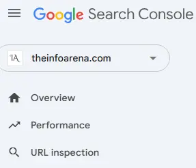
1. Performance Reports: Understanding Mobile Traffic and Engagement
The Performance reports allow you to filter data by device (desktop, mobile, tablet). This helps you understand:
- How much traffic originates from mobile devices: This clearly indicates the importance of your mobile site’s performance.
- The search queries that drive mobile traffic: Understanding these queries can inform your mobile content strategy.
- Your click-through rate (CTR) on mobile: A low CTR on mobile might suggest issues with how your pages appear in mobile search results, prompting you to review title tags and meta descriptions.
- You can also use Google Search Console’s Performance Report to compare Desktop CTR vs Mobile CTR. The insights you gain from the report can be used to optimize CTR on a particular device.
2. Rich Results Test and Reports:
The Rich Results Test tool and the associated reports within Google Search Console are vital for ensuring your structured data is implemented correctly and displaying effectively on mobile. Rich results often enhance the mobile search experience, making your listings more prominent.

3. Core Web Vitals Report:
Found under the “Experience” tab, the Core Web Vitals report provides insights into key metrics related to page loading speed, interactivity, and visual stability on both mobile and desktop. Optimizing for good Core Web Vitals is crucial for a positive mobile user experience and can indirectly contribute to better mobile SEO.
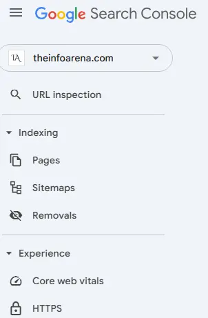
4. The URL Inspection Tool of the Google Search Console is particularly useful. It provides granular, page-level data on how Google sees your URLs, making it an essential tool for troubleshooting indexing issues and understanding your website’s performance.
This tool lets you:
- Check Indexing Status: See if a specific URL is indexed by Google.
- Request Indexing: If a page isn’t indexed, you can request Google to crawl and index it.
- View Crawl Information: Get details about the last time Google crawled the URL, including the crawl date and time.
- Identify Indexing Issues: Discover why a page might not be indexed, such as:
- Robots.txt blocking
- Canonicalization problems
- Page errors
- Mobile usability issues
- View Canonical URLs: See which URL Google considers the canonical version of a page.
- Mobile Usability: Check if the inspected URL is mobile-friendly.
- Enhancements: See information about structured data.

PageSpeed Insights
Page speed is a critical factor for mobile SEO. PageSpeed Insights analyzes your website’s performance on both mobile and desktop devices.
- How to use it:
- Go to Google’s PageSpeed Insights page.
- Enter your website’s URL.
- Click “Analyze.”
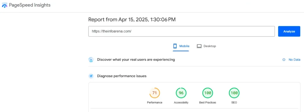
- What it tells you:
- Performance scores for mobile and desktop.
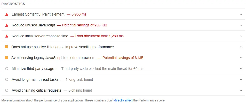
- Suggestions for improving page speed, such as optimizing images or minimizing JavaScript.

Mobile Device Emulators and Simulators
These tools allow you to see how your website appears on various mobile devices.
- Browser Developer Tools:
- Most modern browsers (Chrome, Firefox, Safari) include built-in device emulators.
- You can simulate different screen sizes and resolutions.
- Online Simulators:
- Several online tools offer mobile device simulations.
- These can be useful for quickly testing your site on different devices.
Manual Testing on Real Devices
While automated tools are helpful, nothing beats testing your website on real mobile devices.
- Use different devices:
- Test your site on various smartphones and tablets with different screen sizes and operating systems.
- Check for:
- Readable text.
- Easy navigation.
- Fast loading times.
- Properly displayed images and videos.
Conclusion
I want to conclude by thanking you for reading the post. It’s clear that mobile SEO will continue to redefine how businesses connect with their audiences.
The convergence of AI, 5G, and evolving user behaviours will demand a strategic and adaptable approach. By focusing on personalization, speed, seamless, intuitive, and valuable user experiences, you can future-proof your mobile strategy and build a strong foundation for long-term success.
Ultimately, mobile SEO in 2025 will be about creating exceptional user experiences. By understanding and anticipating the needs of on-the-go users, you can build a mobile presence that not only ranks well but also resonates deeply.
We’re here to support you on your SEO journey – feel free to reach out with any questions!

